
SUPPLY CHAIN MANAGEMENT TOOL
UI/UX redesign
High-fidelity mock-ups of UI
A global organization’s supply chain management tool provides users with visibility and metrics to their global supply chain. The user interface of the current version has only seen incremental improvement since its original release in 1999. Despite a substantial investment into improving the performance of the application’s backend structure, the UI remained outdated, bloated, and counterintuitive.
Background
Design strategy was overlooked resulting in a mismatch between the robust technology and the UI. For nearly a decade and a half, features were added with little consideration for continuity or the effects on usability. As a result the tool is a hodge-podge of styles with indistinguishable icons.


Project Goals
I was challenged to provide users with an experience that allowed them to complete their tasks in an efficient manner. The updated user interface should not only allow the user to complete their tasks, but convey that the application is a best-in-class supply chain management tool. The UI had to convey modern.
Mobile implementation of UI
WHAT I DID
Established Default user personas
In the former environment, users' roles are predefined by an administrator. I suggested a user journey that required very little additional set-up by the administrator.
This was accomplished by providing users with a series of default selections that someone in their role would typically be responsible for. With that being said, users and roles vary from organizations. Keeping this in mind, I recommended that users be allowed to access other tools, thus allowing them to customize their roles.
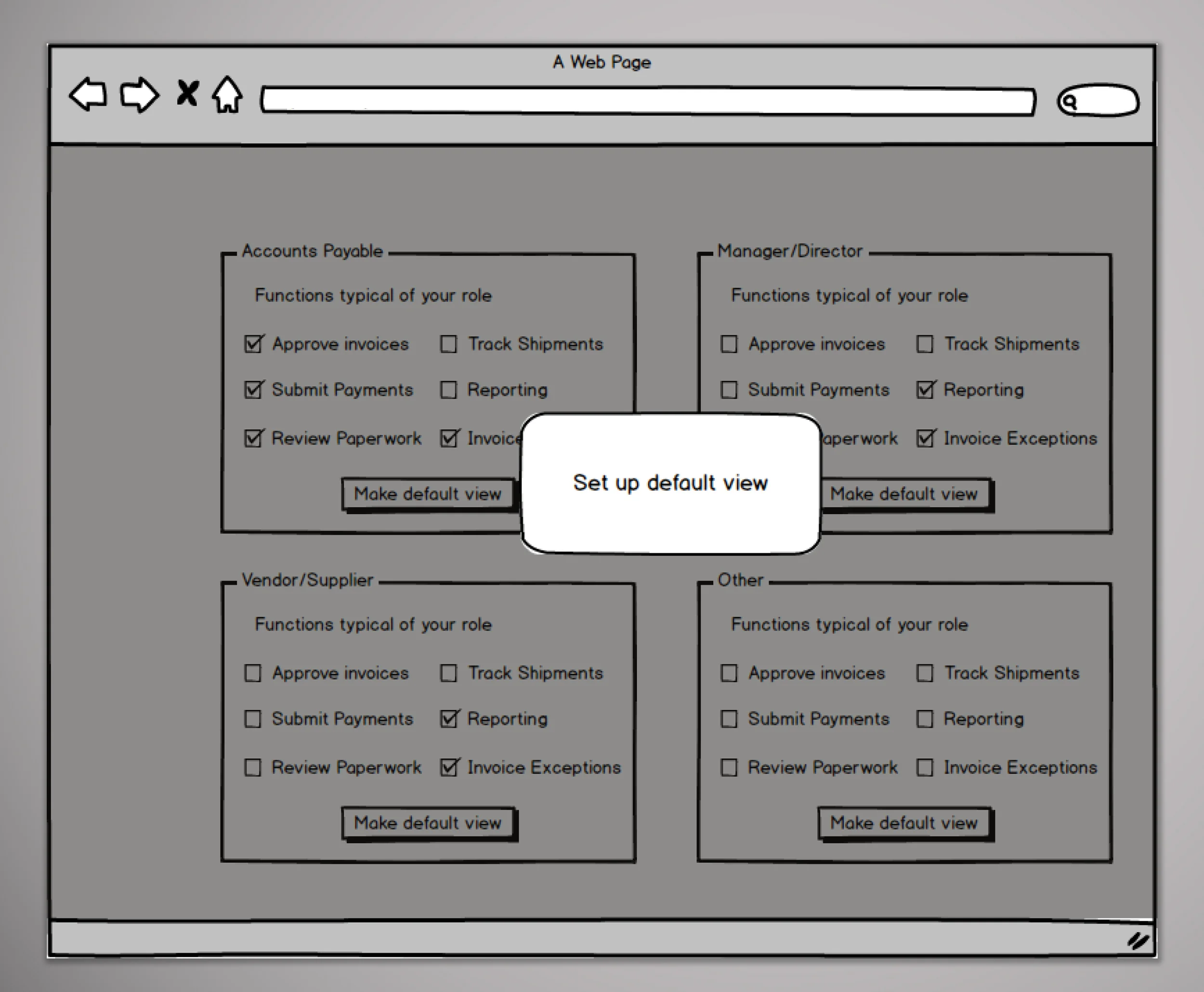
Balsamiq wire frames of role-defined default views
Streamlined Data Visualization
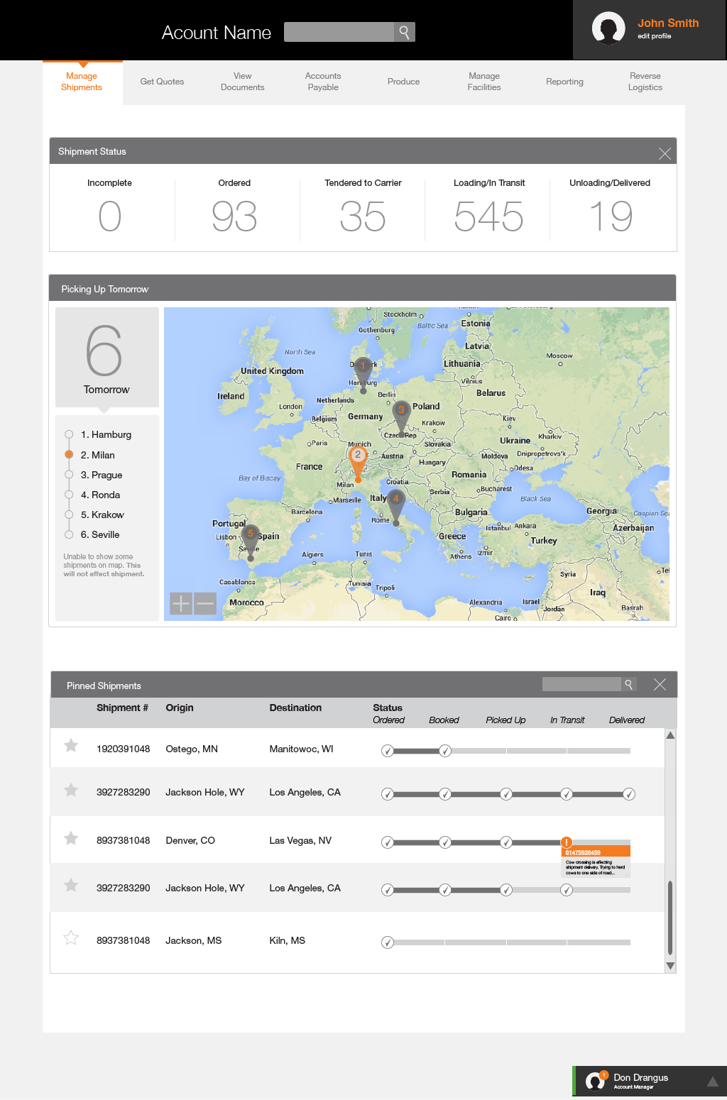
Immediately after logging in, users were provided with a summary of preselected metrics. In the current format, important data was displayed in a series of pie charts. While charts are an effective way to convey trends, they are not an ideal way to communicate precision–especially pie charts.
I encouraged abandoning charts in favor of displaying the measurements using numerals. Through a series of interviews, I learned that these metrics were vital in determining a course of action; the user needed to know exactly what the status was.
Displaying the data in a chart did have its benefits, especially when trying to put numbers in context and identify trends. I still wanted to give users access to view trends but felt that the pie chart was not the most effect way. With the provided bar chart, users could more easily compare the data.
Updated the User Interface
I set out to establish a visual design language on classic design principles and was scalable. The UI had to be flexible and easy to implement by engineers. They did not have design backgrounds, so the design had to be straightforward but still be impactful.