THREE THINGS
A social journal iOS app
Designing gratitude
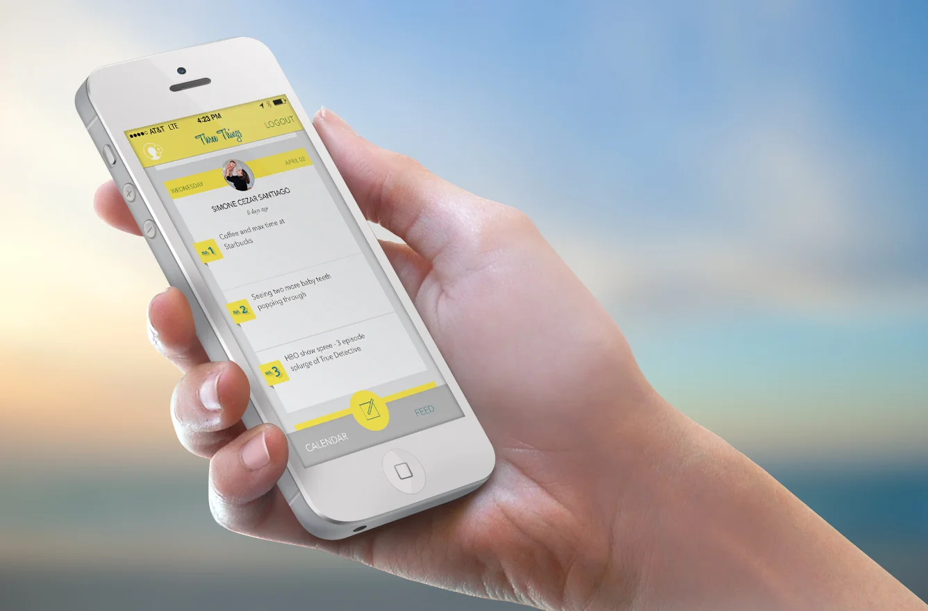
Three Things, a shipped iOS app, serves as a simple outlet for creating a daily log of the things you’re grateful for–both big and small–and a way to share them with the people you’re closest to.
Concept
New psychological research has found that the act of practicing gratitude could dramatically increase levels of happiness. A happier outlook on life could result in better health.
People are trained to identify the negative. It started as a survival technique: early man had to be on the constant lookout for potential harm. Fortunately, we live in a much safer world now; yet our brains are still hardwired to anticipate threats, which can lead us to negative thinking.
Take a quick look at Facebook or Twitter, how many of the people you follow use the forums to vent and complain? If you only read Facebook posts, you might think that life is a drag. But here’s the thing—life is awesome. We just need to remind ourselves of that.
My friend Amee Kamdar knew this and had wonderful idea; an iPhone app where every day you could record the three things that you were the most grateful for and share them with your friends. This social gratitude journaling app beta was named Three Things.
Early UI concepts


Wireframes of the UI for Three Things

Building a Persona
Amee and I agreed that our target demographic would be females in their mid-20s to 40s. The problem for me became, "How do I leave my personal preferences aside and approach this design with an empathetic mind set?"
I needed to build a persona.
I wanted to get a better understanding of our target user. I wanted to make a picture so clear that it could inform my design decisions throughout the entire process. I picked a name: Heather. Then I imagined what would be in her backpack. Visualizing the contents of Heather's backpack helped me break down the design problem from her POV, or the target user’s POV, rather than our own.
Imaginary user Heather and what you would find in her imaginary backpack
Prototyping
The app we were trying to build was actually a fairly complex concept and several of the features were still undefined. It would have been really exciting to jump in and start messing around with Xcode, but before a pixel was moved, or a line of code was written, I built a low-fidelity prototype in Balsamiq.
The prototype allowed Amee and me to get on the same page and test some features before investing too much time or energy down the wrong path. We could change our minds and it would only cost us minutes instead of days in development.

An early prototype forced the user to author their entries for the day before viewing their friends entries. Ultimately, we felt it was too paternalistic.
An early iteration of Three Things forced users to submit their daily entry before they could see what their friends entered. We thought it was a good incentive to encourage people to actively use the app, as opposed to merely lurking to see what their friends were writing.
We shared the prototype with a friend who’s a behavioral economist. After playing around with it, he felt that forcing users to author their entries for the day was too paternalistic and could irritate them.


What I would change
I’m proud that we were able to ship Three Things.
People often say things like, “Wouldn’t be cool if there was an app that did this or that.” We actually executed on an idea. We didn’t ship to try to make money, instead we did it to learn about the process.
Is it perfect? Not. Even. Close. I see a lot of UX blunders when I look at the usage via the server data.
One issue worked itself out through a usability test. I thought really hard about giving the user the ability to review all three entries prior to posting. My thought was to give them another chance to edit their entries before they shared them. I was really proud of my solution and thought UX master Jakob Nielsen would be too.


Soon after Three Things launched in the app store, I started receiving messages from users. They were able to make entries, but the entries weren’t showing up in their feed. I worked with users in-person and no one was having the same problem; it was odd.
Turns out that the review screen that I contemplated so much about was really confusing people. Users would reach the screen with all three of their entries and think that they were done. It was happening a lot too. About 25% of users were completing entries but weren’t able to publish to their feed.
All they had to do was press submit, but it wasn’t as intuitive as I thought. They had to click one more time.
It was a valuable lesson. A designer can think they have the most rational solution, but at the end of the day the users will tell you what works and what doesn’t.